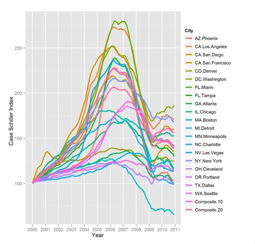
Decision Science News has a wonderful graphic on visualizing the housing bubble, using the Standard and Poor numbers. This is a really data-rich graphic, one of those that is both simple yet complex, and you can spend a lot of time thinking about what the different trajectories mean in terms of the extent and timing of the bubble. This is their first graphic–go to the website and read the rest of the presentation. A second, cleaner graphic calls out the ‘exceptional’ stories–a good way to build a narrative with graphics: first show the whole picture, then select what people should take away.
I’d like to know more about the bounce at the end of those numbers; every city gets higher, then crashes, then (for most, not all), there’s a bounce, then another fall.

The graphic was made with ggplot2, one of my favorite new toys for R.