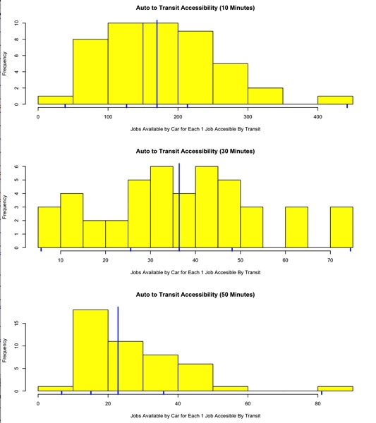
I’ve had students work with these data simply because I want to help them understand how important land use and transit strategies are to job accessibility and how hard the playing field is tilted towards people who can have and drive cars. This was my I spent far too much time yesterday making this graphic from the data reported in Access in America:

It’s so irritating because even in the best transit markets (New York) cars still give job seekers an edge. It would be awfully nice if we could maybe see how these numbers shift with new lines that open, when we get new TODs, etc.