I’ve been experimenting with Twitter and Facebook. For the past few months, I’ve been posting my watercolors, which are amateurish, and interspersed with draft data graphics. There are a lot of graphics that I use for my own learning and no other reason, so I don’t always finish them. Or I am doing them to derive a graphic for students to finish off in order to get them more accomplished with R. I’m not always looking to communicate, and I’m not posting looking to be treated like I’m special or a star in data viz or anything of the sort any more than my posts saying “I’m at a Bach concert” are designed to make you think I am some sort of magnificent patron of the arts. I’m not a consultant selling my data manipulation services. I’ve already got the cookies I need, thanks.
What is interesting to me with this experimenting is that my little draft graphics bring Twitter dudes to critique rather than discuss. I realize this is unscientific, but I have lot of women in computer science in my feed, including some who are accomplished in fields like AI and OR. Not a single one of the women, after months of me posting draft data visualizations, has *ever* come at me with “you need to fix X” or “this is wrong do it right.”
Not. A. Single. One.
Not. One. Not. Ever.
Whereas if I post a graphic that is just drafty, I will get all the boys in the yard telling me what’s what. I’ve never had anybody—despite have tons of architects in my followers—tell me with my watercolors that I should use do things differently (I ought to, but I like just splashing around, thanks.).
Do any of you really think I need somebody to tell me how to use data?
On Facebook, I posted a graphic I had thrown together in Excel which wouldn’t allow me to designate a x-axis label for some reason I couldn’t suss (I think it was just some glitch that would have gone away had I restarted but meh). I posted it on Facebook, told people about the x-axis issue, and asked if they could think of other possible display formats. OMG, the drama! THERE’S NO X-AXIS SO I CAN’T POSSIBLY UNDERSTAAAAAND THIS YOU AMATEUR. I repeated in the comments what the x-axis was. BUT THERE’S NO X-AXIS.
Not a single woman on my Fboo commented on it. Only men. One of my colleagues (one of my favorite colleagues) and one of my *students* (a beloved one) were in the mix talking down to me like *crazy.*
After that, I started letting partially done graphics out in the world more often and keeping track of who commented negatively. After two years, I have 10 graphics and about 30 comments, none from people who present as female on social media. Insta is a bust. People don’t seem to be too critical on Insta and I don’t have many followers, both of which makes me like it very much. And it has pretty pictures.
On Fboo and Twitter, I have a bunch of comments, all from men, just about all negative.
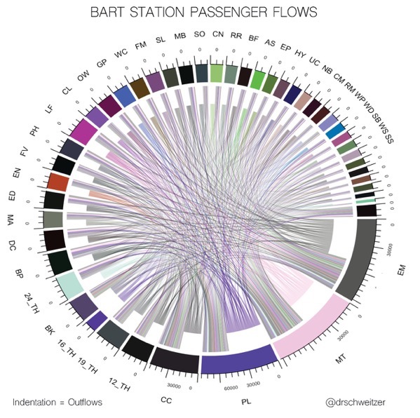
Yesterday evening I posted this:

With the clear indication that I was diddling around, that it’s a draft graphic. A student gave my class some BART data and some people have done a lot with it, others haven’t done anything with it, and I’ve been looking for ways to show them that they can use both the O-D data. I’m also messing with Sankey diagrams.
I got everything “every graphic deserves a legend, I don’t know what’s going here” (Fair enough, but I’m not sure if I am going to bother with making a legend or just using proper station names in labels) to “Well, Berkeley students did this first!” Along with some comment that I wasn’t showing much originality using a chord diagram. Christ, nobody is taking *anything* away from Berkeley students, I didn’t claim to invent anything here, and *I’ve* never made a chord diagram before, so it was fun and new for me. Isn’t that enough?
But no, it’s not enough.
All from dudes.
Guys, knock this shit off. This is a way of trying to sanction a woman for participating in high-status places (data viz, computer science, etc) you want to reserve for yourselves, and it’s not ok. Graphics do not need to be perfect to be instructive, and—believe it or not–nobody asked your opinion. This is a form of mansplaining, and it’s not welcome. “Tell me how to improve this” is an invitation. “Hey, I screwed around with data” is not a invite for all y’all to come along and tell me I DID IT WROOOOOOOOOONG.
I repeat: knock it off. Make space. Don’t police it.
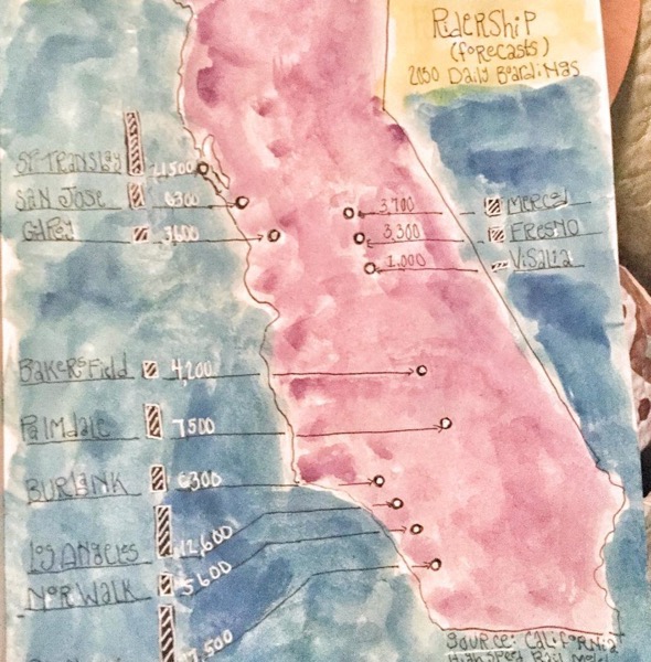
I would contrast this last experience with a graphic I posted two Sundays ago that mixed watercolors and data: 
Now, this son of a bitch is hard to read, and the photograph chopped off the source AND the last station. It’s a mess, from execution to data display. Did I hear a peep? No. Not a peep! In fact, the train nerds began a super-long discussion about the forecasts, etc, so much so that I finally told them to go outside. (One of my students helpfully pointed out that one can tweet outside.)
Bottom line: watercolor is not a prestige space the way data viz/science is. Nobody need police these creations to assert status and power-knowledge.
All of this is conjecture, based on a limited run in one person’s social media. But it’s solid enough that it’s probably worthy of a bigger field experiment. Maybe I’ll do it. Maybe somebody else—by all means, I’d love to see what others came up with. Either way, people are welcome in the yard. Just behave yourselves.